FieldShield PII Discovery Charts
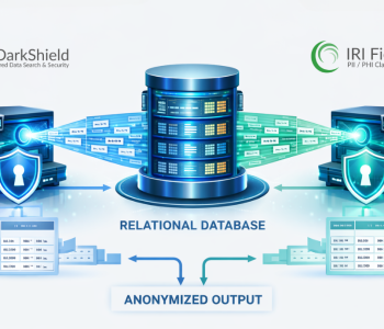
Among the PII data profiling and data discovery tools in the IRI FieldShield data masking product is an interactive data visualization panel, or dashboard, for PII search results. These data discovery displays are derived from the results of searches for PII in structured sources like relational databases and flat files.
The HTML5-comptabible charts are viewed in a browser, and created from schema or directory searches launched from job configuration wizards in the IRI Workbench Data Discovery menu. The search jobs produce statistics about, and provide insight into, specifically defined classes of data.
Each data visualization is based on a data profiling or search log, and complements the text-based reports the search wizards also produce. Note that IRI DarkShield users can also produce graphical dashboard charts for data analysis from their searches through structured, semi-structured, and unstructured data sources. See this article for those details.
The dashboards described in this article flow from these Workbench data data discovery wizards:
Each dashboard uses Chart.js to create graphs that provide visual frames of reference for the data, rather than merely exporting log data to a spreadsheet or BI tool to provide the visuals. Any external system like that would have to import, restructure, and build a display from the log data from scratch. Instead now, it’s all automated in, and launched from, IRI Workbench.
In addition to providing a more graphical version of what’s in the text output, the charts actually extend the capabilities of the data discovery wizards. If the chart option is selected, a page containing the charts will automatically display upon completion of the wizard.
Data Profiling Dashboards
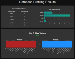
In the case of the DB Profiling wizard, the HTML page will display the following charts:
- Recurring Column Table – displays titles of the most common columns throughout the dataset. When you hover the mouse pointer over the right column (number of occurrences), a box display shows the list of tables where the column was observed.
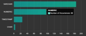
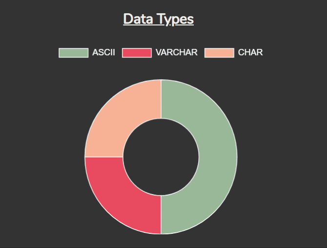
- Data Type chart – represents how data is represented across different types
- Min and max values – area charts indicate trends via minimum and maximum values
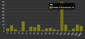
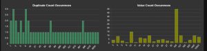
- Count measurements – these bar charts can also reveal trends or anomalies
- Length measurements – area charts show trends in the length of the values, helping to identify consistency within a dataset
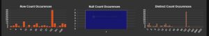
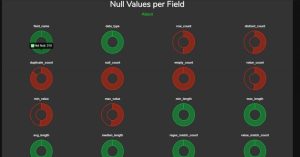
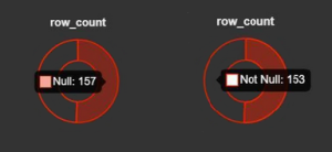
- Null values per field – charts showing how much of each field of the dataset is null
- Regex & Value match counts – any results displayed here, or shown as “Not performed”
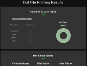
For the Flat File Profiling wizard, that dashboard contains the following:
- Recurring Column Table – displays titles of the most common columns in the dataset. When you hover the mouse pointer over the right column (number of occurrences), a box display shows the list of tables in which the column was observed
- Data Type chart – a doughnut graph of how data is represented across different types
- Min and max values – displayed side-by-side in a table, indicate trends via minimum and maximum values
- Count measurements – horizontal bar charts that may reveal trends or anomalies
- Length measurements – bar charts show trends in length helping to identify consistency amongst a dataset
- Null values per field – charts showing how much of each field of the dataset is null
- Regex & Value match counts – results display here, or else show, “Not performed”
Data Class Search Dashboards
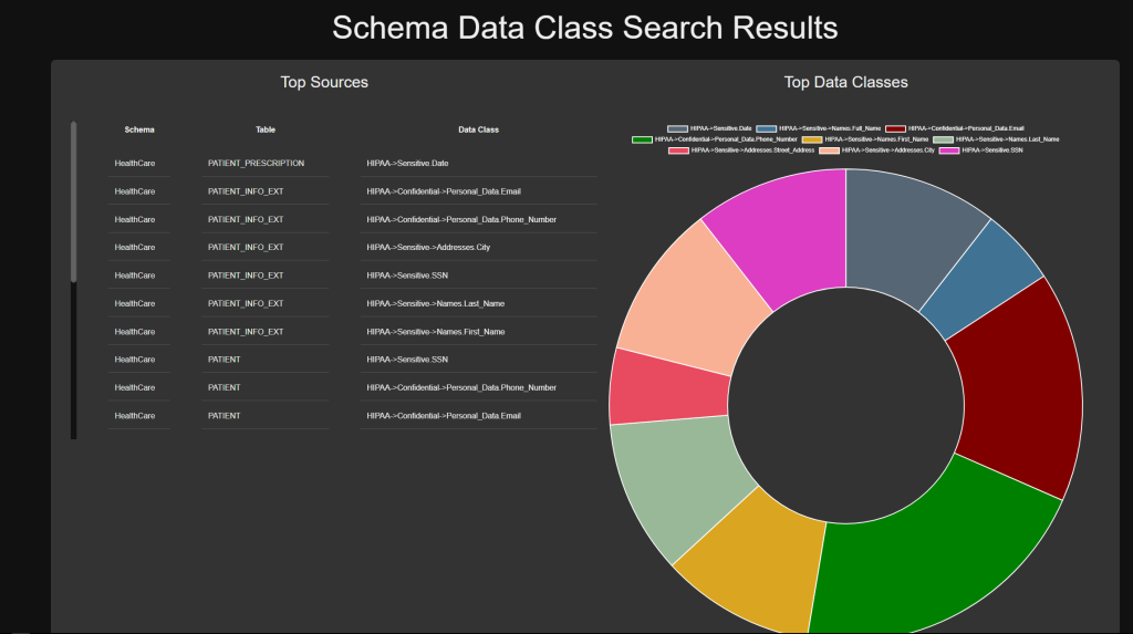
Each Schema Data Class Search job can produce two charts:
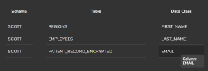
- Top Sources Table – displays the schema, table, and data class found through the search. When you hover over the schema column, a box displays the profile name. When you hover over the data class column, the corresponding column is shown. The table is also scrollable, allowing you to see the rankings of large datasets.
- Top Data Classes – represents the data classes by number of occurrences, all
owing you to understand what portion of the data matches the selected class. Within this chart, you can click on a pattern in the legend, and the selected section of the chart will be hidden.
Finally, the Directory Data Class Search dashboard also consists of two charts: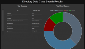
- Top Sources Table – displays the data class and corresponding file found through the search. When you hover over the file column, a box displays showing the path, and when you hover over the data class column, the corresponding column is shown. The table is scrollable, allowing you to see rankings of large datasets
- Top Data Classes – represents the data classes by number of occurrences, allowing you to understand what portion of the data matches the selected class. Within this chart, you can click on a pattern in the legend, and the selected section of the chart will be hidden.
Interactive Charts
Following are more detailed looks into the charts available in some of the dashboards above.
Profile charts
Most of the charts feature hover functionality, where a user can learn more about the data while pointing the mouse at a dataset. This makes it easier to see individual details like the number of occurrences of a searched value, or data type, in the tables you selected in the wizard to profile:
Beneath the title of each section is a small About link. When clicked, a section is displayed that describes the data being shown in each section:
Before

After

The chart’s algorithms parse and process the results from the wizard, and utilize Chart.js to create a visual representation for each item of information. However, if the item was not selected within the wizard, or contains a null data set, it will not be created, and the other charts will simply resize to use the space available:
Row with 3 items:
Row with 2 items:
A way to double-check if an item is null is to scroll to the Null Values per Field section. There is a small doughnut chart for each field showing what percentage of the data is null, or not null.
The charts are automatically colored to help make the result stand out: if the chart is green, then 50% or more of the field data is not null. If it is red, 50% or more of the data is null:
Again, hovering will allow you to get a more detailed look at the raw data:
Data Class Charts
For the Data Type doughnut charts seen after Schema Data Class Search and Directory Data Class Search jobs, you can click on an element within the legend and hide that section. This way you can customize the chart to show filtered results.
Hovering over sections of the chart will also reveal the number of hits associated with the data class:
These dashboards also include a table of the top sources. Each row contains the source and the class or pattern found in that source.
The data class charts have three columns containing the schema, table, and data class while the directory data class chart only contains the source file and data class.
Hovering over the entries will reveal more information about the location of the data class.
You can learn more about the IRI Workbench graphical IDE for IRI data management jobs here. If you have any questions about or need help using the charts or reports from the data discovery logs generated by the wizards in that menu, please contact support@iri.com or your IRI representative.